Civic services through conversation
Corra App
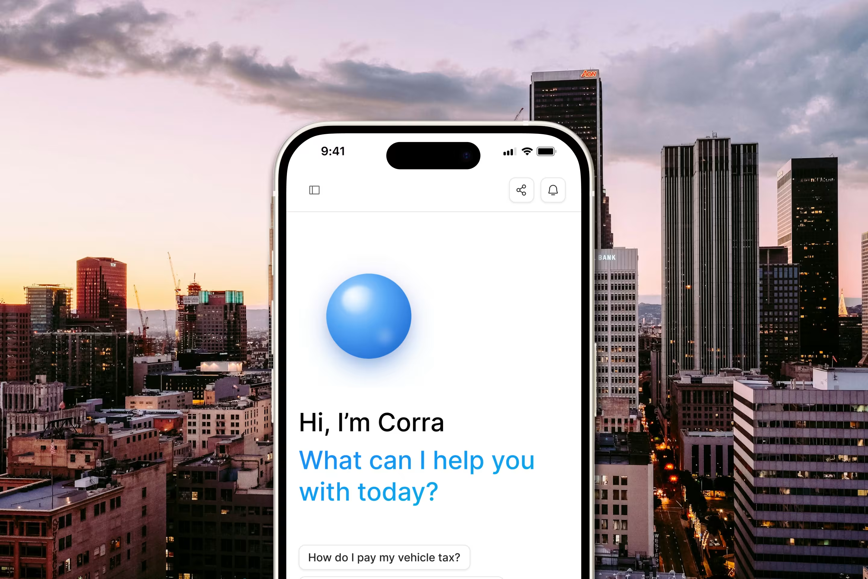
Corra is a Public Services Assistant that helps citizens navigate everyday government tasks like taxes, permits, payments, and service locations through natural conversation. Instead of wrestling with confusing portals, users simply ask Corra and get clear, guided answers in seconds.
We designed Corra as a complete ecosystem across two sides of the same product. The citizen-facing the app turns intimidating bureaucracy into a friendly, plain-language conversation, while the admin dashboard gives teams a single place to monitor the assistant's health, understand where it falls short, and turn those gaps into better answers. Tying it all together is a brand identity built to feel trustworthy enough for a public institution, yet warm enough that everyday citizens feel comfortable asking for help.
Key Challenge
Public services are intimidating from both directions. For citizens, it means dense jargon, scattered information, and forms that assume you already know the process, an experience that needed to feel approachable and human for people who are often anxious or unsure where to start. For the teams running the service, most chatbot dashboards report vanity metrics like total chats and session counts that look busy but never reveal whether the bot is actually working.
On top of this, civic and government products tend to look cold, bureaucratic, and forgettable. The brand needed to signal credibility and calm authority while staying human and inviting, a balance most public-sector design misses entirely. Our challenge was to solve all three at once: an effortless citizen experience, an actionable admin tool, and an identity that holds them together.
What We Did
For Corra, we delivered an end-to-end experience spanning the citizen app, the admin platform, and the brand system that unifies them:
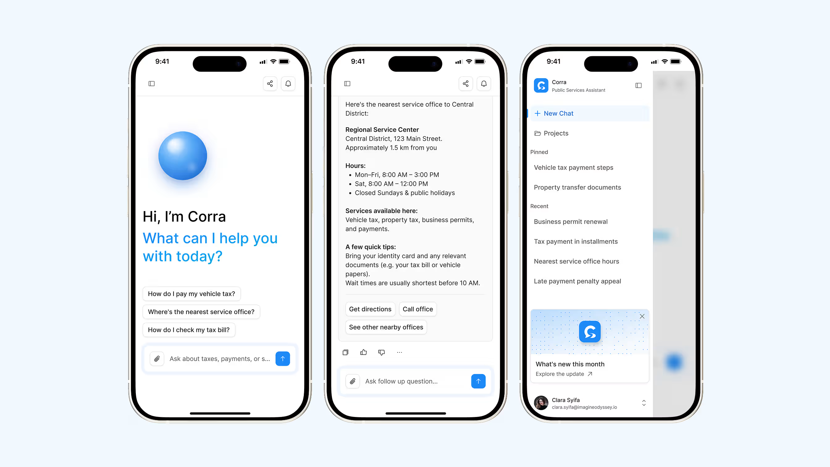
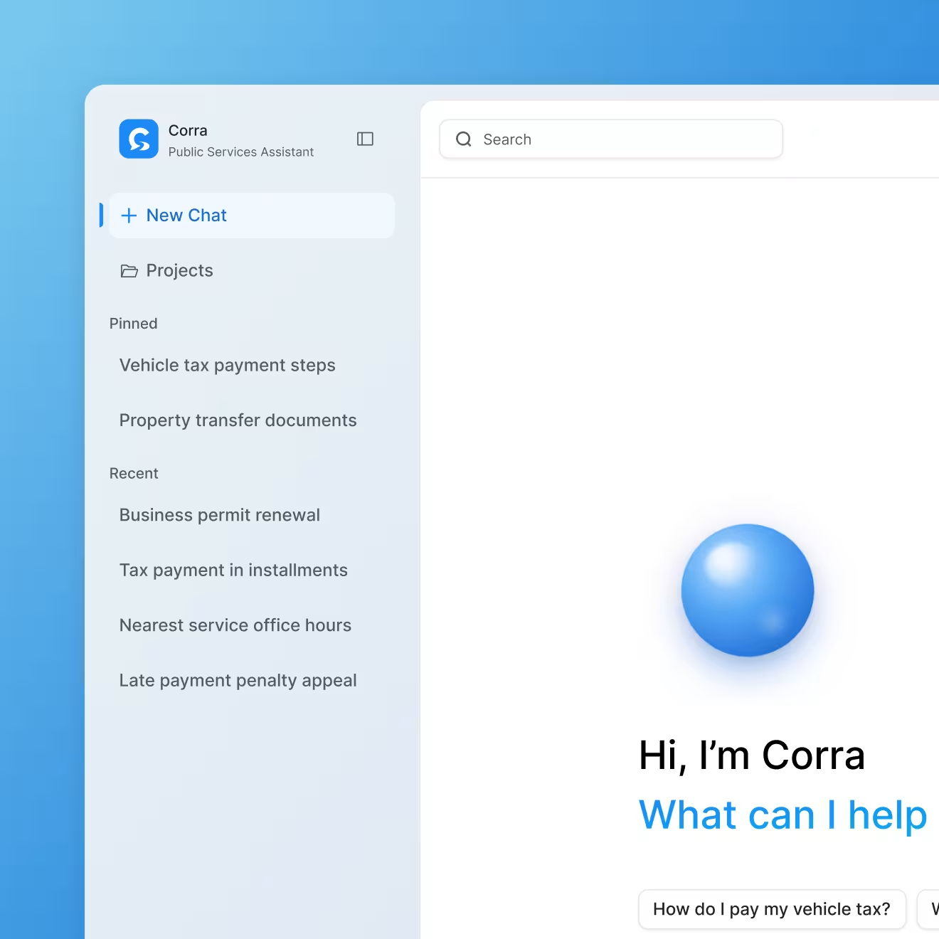
- Designed a warm, conversational citizen experience with contextual starter questions and structured, scannable answers (locations, hours, required documents, next steps) so users get a clear path forward instead of a wall of text, plus a lightweight history layer to revisit past answers.
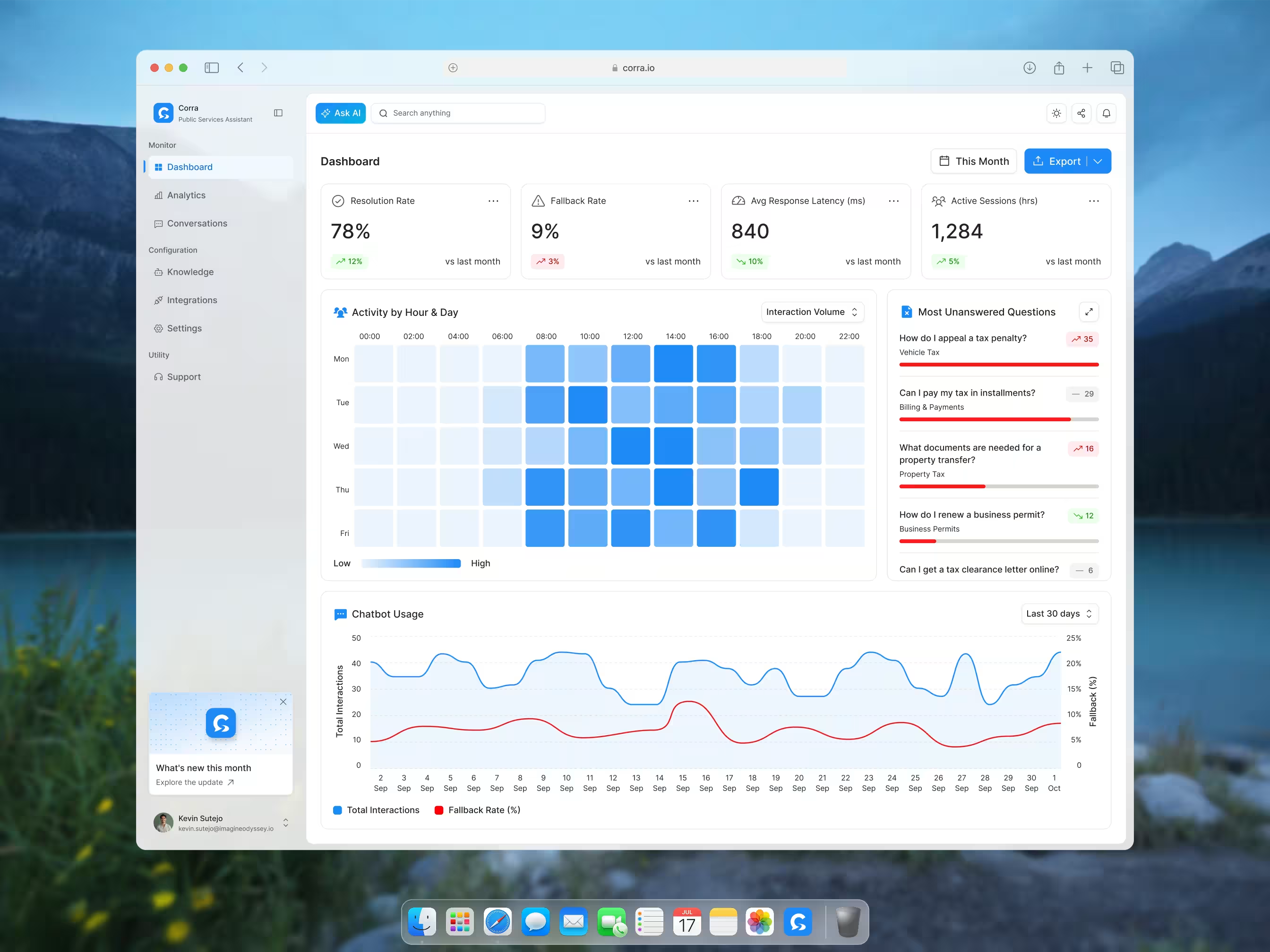
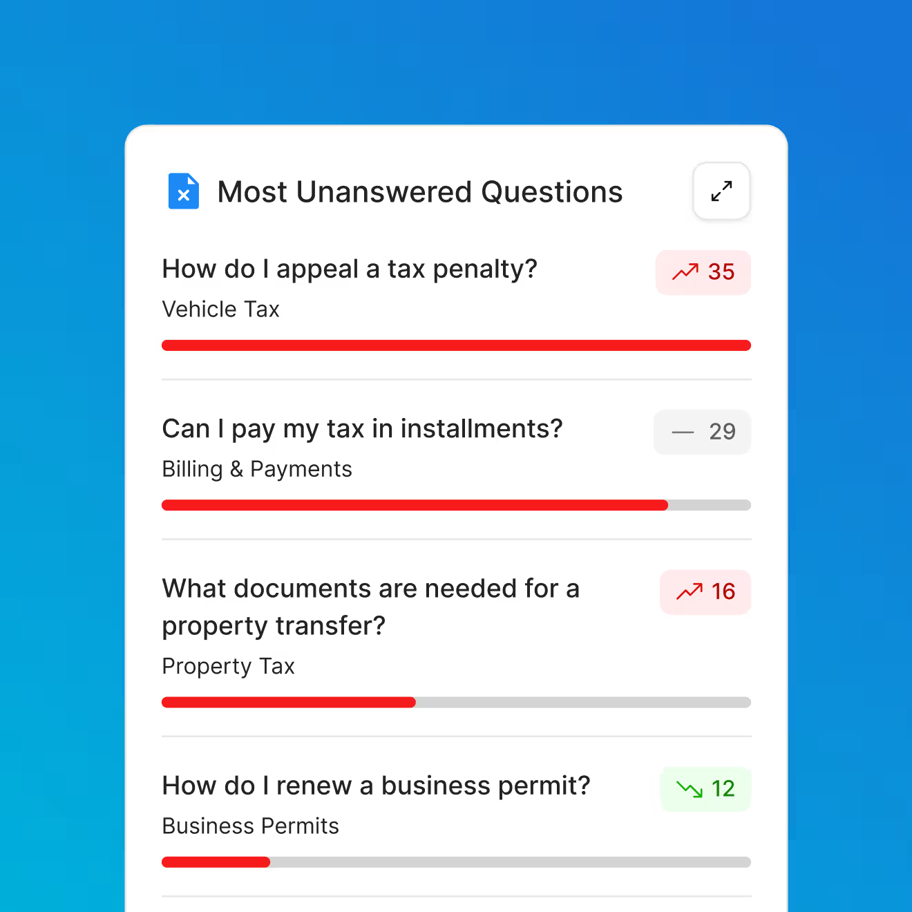
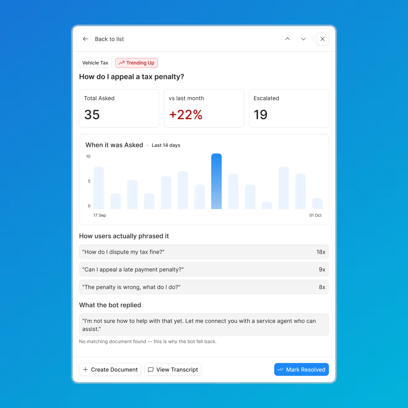
- Built a health-first admin dashboard that replaces vanity metrics with KPIs like resolution rate, fallback rate, and response latency, unified usage and failure data into a single trend chart with an activity heatmap, and a Top Unanswered Questions system that turns real failed queries into one-click prompts to fill knowledge gaps.
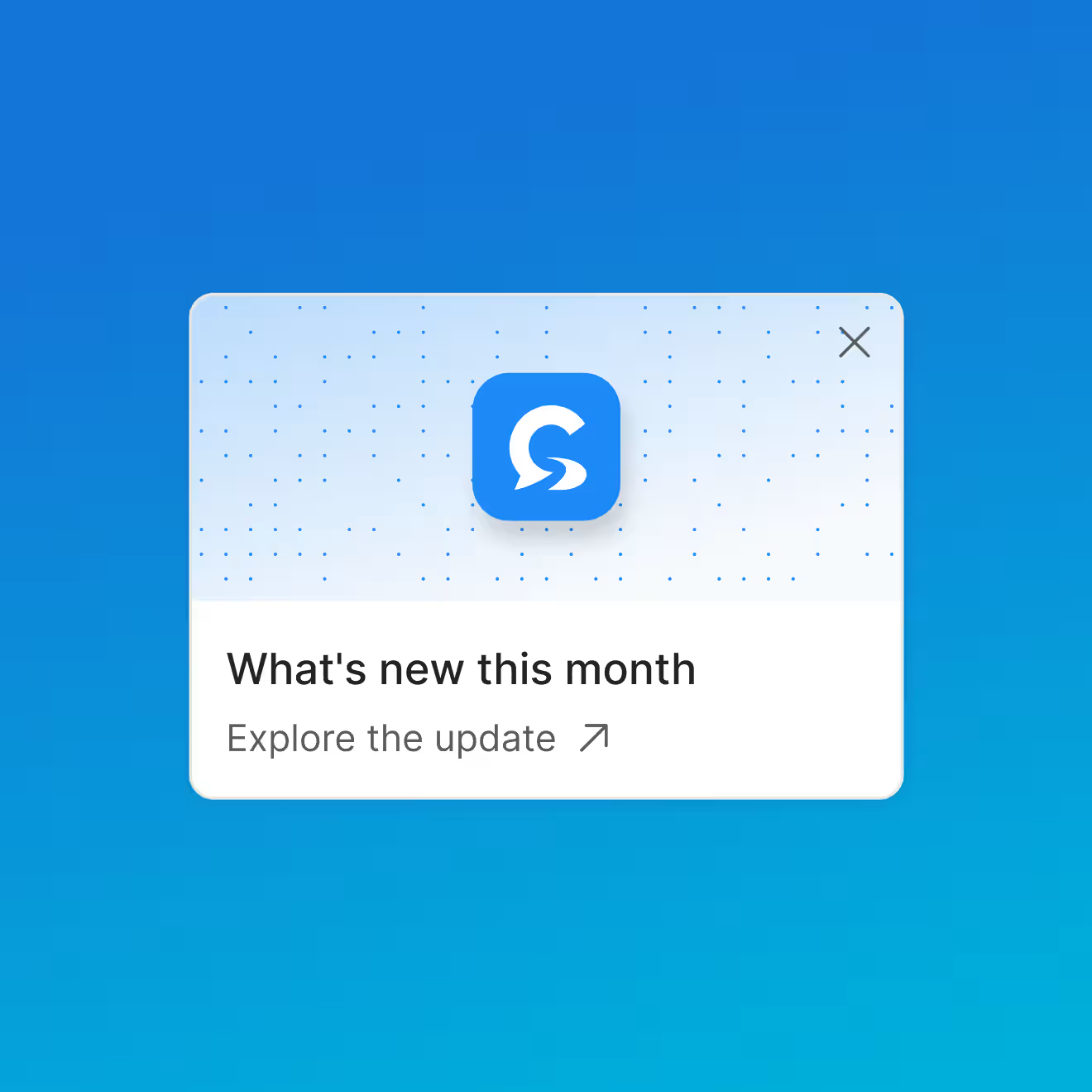
- Developed a calm, civic brand identity anchored by a conversational "C" monogram that reads as both an initial and a speech mark, built around a trustworthy blue, soft neutrals, and clean geometric type, applied consistently across icon, UI, and product mockups.
Credits
UI/UX Designer